Game Dev progress report: Lacking progress...
Posted by: Owen, 04 Mar 2010 23:31
It's been just over six weeks since I released my first attempt at monetising a complete flash game, Pompetaire, out into the wild. This game just had a pre-loader ad attached (no attempts at finding sponsorship were made) and was uploaded to Kongregate (no ads), Newgrounds and added to Mochi's distribution list.

To date the game has earned a grand total of.... wait for it..... $2.37!
$0.85 of that comes from Kongregate from 666 plays (35% of a total revenue of $2.42) all of which were mostly from the first week, with the rest, $1.52, coming from MochiAds from just under five thousand ad impressions. Over a third of the mochi earnings came from a single site, onlinespiele24.org, which only picked up the game over three weeks after the game was first released.

Suffice to say the game never "gained traction", to borrow Metaplace's phrase, with reviews being decidedly average, hovering just above the 50% mark.

So all in all a failure!

But with every failure there are lessons to be learnt, some of which I had in mind when putting together my next game Trinhex.
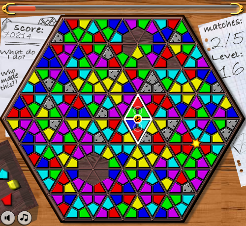
Spot the reused assets!

This is a colour matching game based upon Raph Koster's original game Wheelwright


This time I decided to take the sponsorship/licensing route by using FlashGameLicense.com, which can provide the potential of a few thousand US dollars per game, assuming you can manage to entice a sponsor to put in a bid. So far the game has been available to potential sponsors for just over two weeks now with no solid offers, but it is still considered too early to say how it will do. It may take up to a month or two before the right sponsor comes along.

In the mean time I am working away on game number 3...
Tags: Games, Flash, Pompetaire, Trinhex

1 Comment
Comment by: I am a bot, 02 May 2010 20:00
hey obo i played the pompetaire game. i think it could be very fun. not like the best game ever, but ok. just a few observations, from my short time playing it:

it took me a while to understand how to play it, even with the instructions, and considering that not many people read them, well. its a bit hard to make sense of the idea of stacking different shapes for the number of corners they have. why not stack something else that is visually easier to make sense of, and maybe more interesting. something that is comprised of layers, for example a sandwich, a burger, a cake, which requires them to be in proper sequence. something less trivial that might also work... building a totem. that can be visually attractive. imo that way the game would feel more natural. the geometric shapes are boring, especially the ones like lemons.

other thing: the pieces yet to be dealt, i think that area should be more obviously clickable. another color or something that looks like a button. mostly because is there together with display info and game settings, at the top left, while im mostly playing at the middle/bottom right, not caring much about that area during the game and not expecting that to be of much relevance.

little thing. the grayed out geometric shapes in the middle and the vol control feel misplaced.


- just saying -


Submit a comment:
Preview:
* Name:
E-mail:
* Type I am no bot here:
* Comment:

A site about my fumbling my way through programming, astronomy, game design, life... and everything else geeky.
Blog Post Categories:
Games (20)
Programming (17)
Flash (14)
Metaplace (11)
Fog of War (6)
playtest (4)
Trinhex (4)
Blockdown (4)
GameCraft (4)
Astrophotography (3)
DIY wedge (3)
me me me (3)
Pompetaire (3)
Canon 10D (2)
Tile Tactics (2)
site (2)
hacking (2)
#1gam (2)
Game Jam (2)
DIT (2)
NexStar 6SE (1)
Canon 40D (1)
Moon (1)
timelapse (1)
SCIENCE! (1)
tog.ie (1)
gamedevelopers.ie (1)
IGSDublin (1)
Save the Zombies (1)
dubLUDO (1)

www.oscan.net
oscan.net (2024) All Rights Reserved.
[Login]